


Apple just made a big splash in our fintech fish tank
Everyone and their uncle have been saying that it‘s only a matter of time until Apple get serious about fintech. Yesterday was that day.
The Apple Card looks darn slick and I want one.
I have also been dabbling in this #fintech space for a few years and wanted to share first impressions from watching the event and predictions on the impact this might have.
First impressions

Transaction enrichment is the new norm.
Meniga works with many of the most innovative banks in the world, doing exactly that. Categorizing and merchant mapping transactions. One of the highest ranked UX feature for many of our bank customers in Europe, is the ability to change the garbled POS text to something meaningful like the name of the brand you shopped with. Sounds really basic, but most banks are still not there.
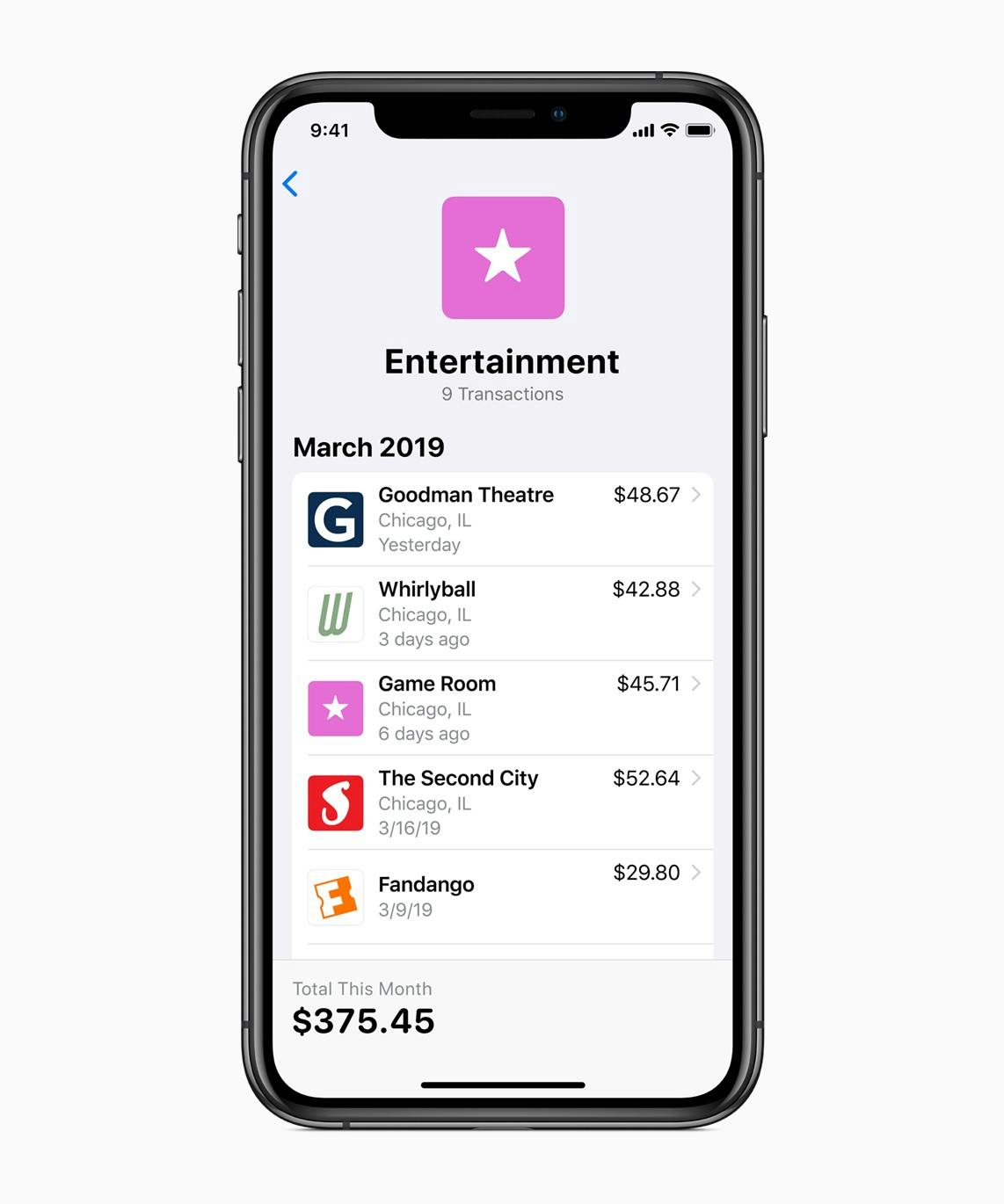
Categorizing your spend to give insight on our expenses is also the best way to help people improve their financial lives. Most people don’t like budgeting but many like to track how much they spend on food, clothing, transport and entertainment. Digitization of payments has made it more difficult to keep track of your daily expenses and categorization enable envelope like budgeting retrospectively.
It looks like their categorization engine is taking the same approach as Revolut and Monzo with roughly a dozen categories. This is of course a great simplification in the UX but in my experience, it is not granular enough to make an impact on my spending. For example, by combining all my food spend in one category groups my fast food, cafe, restaurant and grocery spend into one massive amount. Fine for many people, but if you want to improve your habits, I believe more granularity is required. I wrote more about this in another blog.
I celebrate this move and love the fact that Apple seem to be on a social responsibility run. Their screen time feature has actually helped me curb my usage and I hope that the Apple Card will help many people sort our their finances. Based on the research I’ve seen, I know it can help a lot of people.
Apple even agrees with our tagline of helping people lead better financial lives.
An underlying theme that will be hard to compete with on the bank side, is the fact that Apple is making a firm commitment to people’s privacy and data sharing privileges. They claim that the new News+ app and also the enrichment of transactions happen on the device. This is a fantastic move, but I struggle to understand how you build a good merchant directory and adaptive categorization engine by only using data from one individual. Machine learning for one person sounds a bit off.
Apple still don’t get data visualization
I tried so hard to like the Apple watch. The daily charging killed it for me, but I seriously disliked their doughnut charts for my activities. It was almost impossible to gain any insight from the way they presented my data.
For me, the Screen time was a step in the right direction. Stacked bar charts are not great, but at least I could get some split between time wasted on my phone and a nice breakdown of time spent within each app.
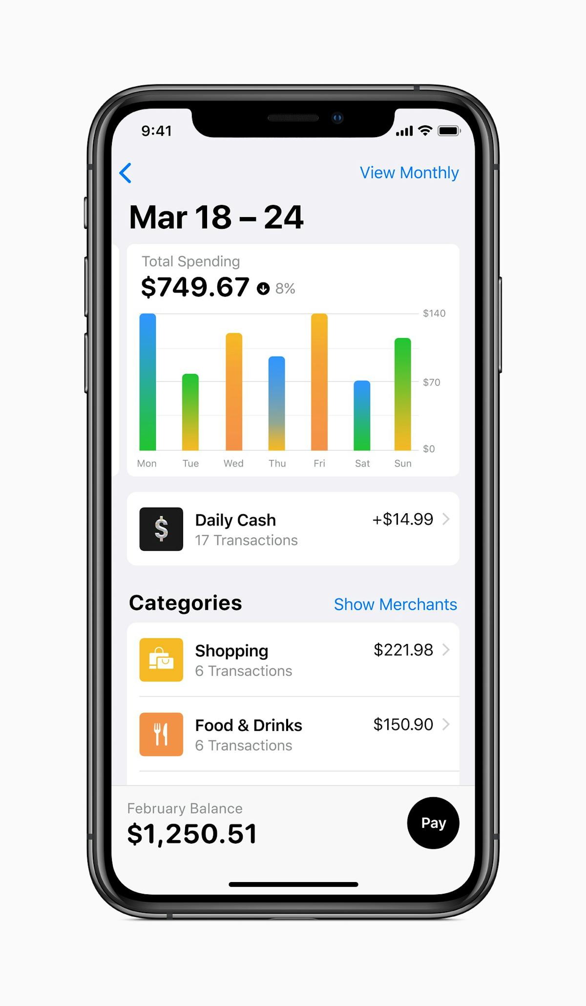
This brings me to the spending graph. Why oh why would you use gradients in a stacked column chart. This is some new type of mess I had not contemplated as a visualization option. It probably tested well. Like doughnut charts and pie charts. People prefer round things to square. Gradients are also more familiar from nature than stark contrasts. But if your intent is to figure out why your expenses were so high last Friday, seeing a blurry orange gradient is unlikely to give you any insight. Testing this with people’s actual spending date might have returned different results.
Of course this is just my personal opinion and maybe Apple has found a way to introduce the right amount of data visualization without offending people that hate to reflect on their spending. This tends to be the case for materialistic people that hate to see how little they have to spend on shiny new things.
The Card
My first thought was. Why do I need a card? I thought they were pushing Apple pay.
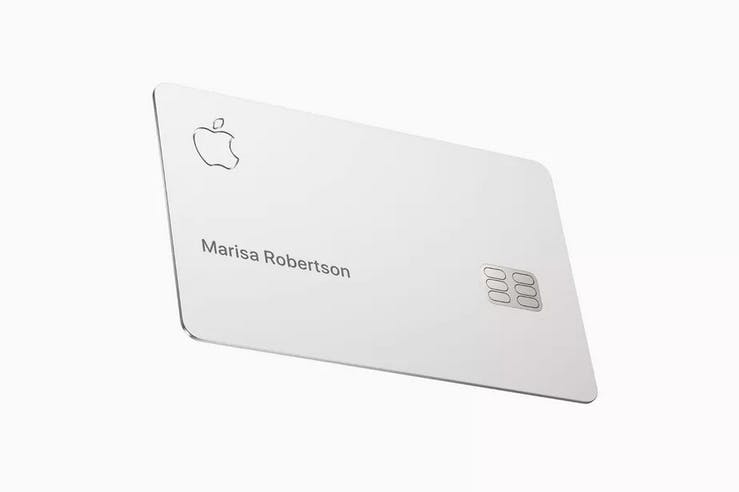
But then it dawned on me. One theory on why Apple phone sales are struggling is because it is hard to see if you have a one year old $600 phone or the latest $1,000 model. The AirPods are becoming the new standard for this same reason. People seek this validation of being a part of the tribe. The wild ones that try new things, are open to experience and can afford the latest Apple products.
How would that cute guy at the coffee house know that you have the new Apple Card if you can’t wave it about.
They also had me at a simpler than Simple.com, Titanium and lazer etched. Take my money!
The financial side of it
Apple and Facebook don’t want to be banks. They want to have the transaction relationship with the loyalty and data that comes with it. Even though the enrichment happens on the device, I assume that Apple might be keeping the geo information that comes with every Push notification. If only to protect you. I could be wrong here, but the largest missing piece for all the machine learning options today is our daily spend. This is what makes up our lives and has great value. It also presents so many opportunities to deliver a personalized experience, a huge focal point for all the services presented yesterday.
So to no surprise, they drop all fees and as they do, totally redesign the financial product for simplicity that any bank could have done. But didn’t.
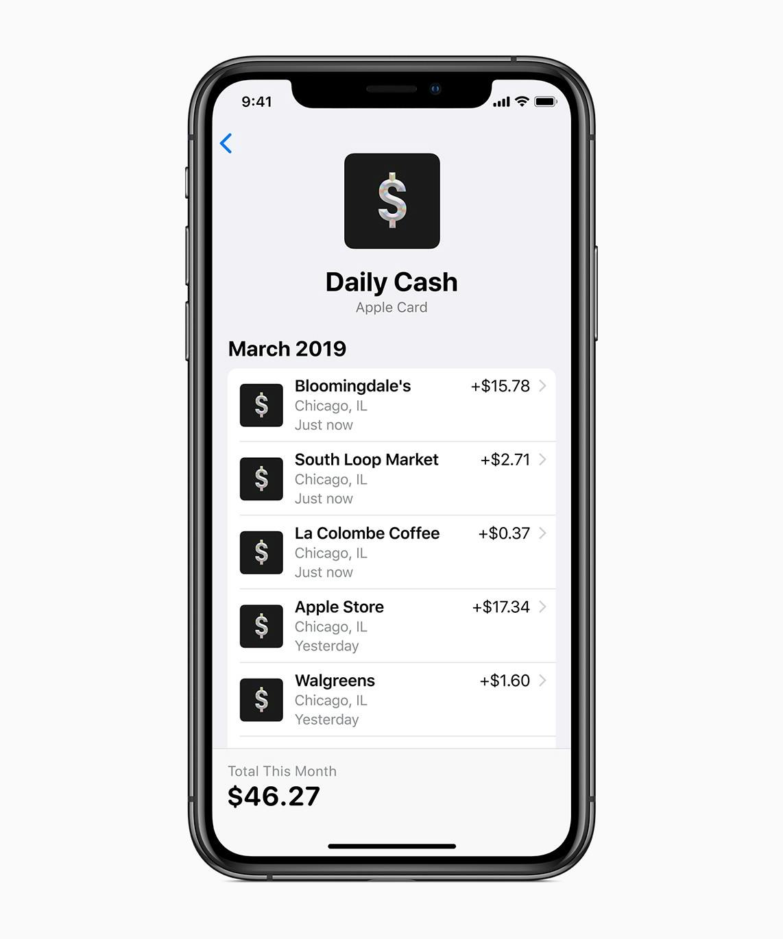
They are also introducing cashback rewards, but not much innovation there aside from the daily deposits. Flat cashback, same discount for everyone and no personalization in sight (yet). This is similar to many card providers in the US, but with their integrated approach, the habit forming loop of getting notifications on your cashback and collecting that money on a different card is a very nice UX execution.

The pay option is also designed from an empathetic direction where you see the accumulative interests of delayed payments. Thing is, that many people like to delay the inevitable and I have seen data that supports this case. People who have to call a service representative to split their credit card payments pick a much more aggressive payment plan then when you can use a slider to pay the least amount possible today. Interests on credit card debt will be a new source of revenue from Apple and I look forward to seeing how they’ll optimize the UX of people defaulting on their new MacBook pro with a 3% cashback.
Conclusion
It is a very solid splash from Apple, I expected nothing less. I hope I get to experience it myself. But living on a small island that was once deleted from an Apple keynote world map (never forget) does not bring my hopes up.
I expect healthy on boarding numbers for the card and look forward to see how people react to this new service offering from the brand we all love to debate.